VFR sectional color change
A couple weeks ago, the aviation community woke up to the latest editions of the VFR Sectional charts from the FAA in their EFBs and had a surprise on their hands: it was suddenly much, much more difficult to read the charts. The colors had changed!
Where the difference between things like Class B airspace boundaries and Victor airways had once been unambiguously clear shades of blue, they were now all kind of similar muddled variations on green.
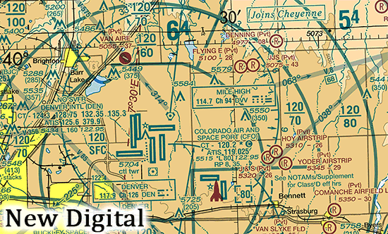
Comparison of the pre-October-2025 digital sectional chart to the October 2025 digital sectional chart. Note the change from blues to greens for various features, notable the Class B airspace and Victor airways.
Surely it was a mistake. After all, the FAA has a specification for the VFR sectional and TAC charts. The colors in the specification have been stable since at least 2022, and the blues in that specification are indeed Pantone 307U with various halftones; no mention of greens.
And indeed, in short order, the FAA acknowledged that the colors were changed a bit in the digital versions and even took the extraordinary step of reissuing the October 2, 2025 series of sectional charts with slightly tweaked colors (official notice here).
Except… that didn’t put things back to the way they were. Still green, just slightly darker green. No blues, at least not outside of water features. Here’s a back-to-back-to-back comparison of the old charts, the new charts, and the “revised” charts.
Reading the FAA’s announcement closer, it turned out that their goal was to make the digital versions of the charts match the print versions more closely. To a rounding error, nobody in aviation in the USA actually uses printed charts anymore, me included. It took a bit of effort for me to track down print versions of both the new October 2, 2025 edition of the Denver sectional as well as an earlier version from April 2023 so that I could compare them to the digital versions everyone really uses.
Wouldn’t you know it: both the new and the old printed sectionals matched the “green” of the new digital sectionals! We’d all been so focused on the digital versions for so long that we’d all forgotten what the printed versions even looked like.
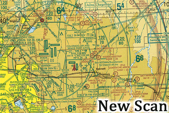
Comparison of scans of the paper maps from April 2023 and October 2025. Note that the colors turn out to be really similar, and that the pre-October-2025 scan *doesn’t* have the blue tones of the digital version.
In fact, the only real differences between the old and new printed charts are that the terrain-height browns are a bit darker on the newer ones and that they switched the printing from spot color to process color. I’m not sure why the browns changed, since the spec didn’t; it doesn’t seem to be a gamut issue. The change from spot to process color seems to have happened at some point between April 2023 and October 2025, but the result is pretty similar in print.
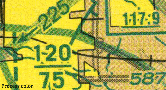
The October 2025 sectionals are printed with process color. Earlier sectionals, such as the October 2023 edition that I had on hand, were printed with spot color. The difference is shown in these zoomed-in portions of the scans of the new and old charts.
The color issue for the blues seems to be solely about the digital versions.
As best I can tell, the digital versions of the charts prior to October 2, 2025 used pure hues according to some sort of hierarchy, with no mixing of hues. For example, the dark blue of a Class B airspace boundary had high priority, so it was shown on the chart as just dark blue. Similarly, the Victor airways were moderately high priority, so they were depicted as just light blue with no mixing in of the underlying yellows or browns. Stated differently, higher-priority colors would effectively mask out lower-priority colors.
For the October 2, 2025 digital editions, this approach seems to have changed. The hues depicted in the digital versions of the charts came to be mixed in the same way that they already had been on the printed charts: blues overlying yellows mixed to became greens, for example; no masking, no hierarchy, no priorities.
I think the FAA misunderstood the criticism of the new October 2, 2025 digital chart releases. People don’t want the digital versions to match the printed version more accurately. Instead, people want the digital versions to go back to the old way of masking, such as using pure blues instead of mixed greens for Class B airspaces (among other places).
As it stands, the new-style digital charts are really difficult to read. It’s bad in Denver, but it’s a disaster in places like Philadelphia where everything just melds together into one indecipherable mess. The only practical solution is to turn on things like digital airspace overlays in the EFBs.
Maybe we’ll all get used to it; after all, the printed charts have been this way for a long time. Or maybe somebody will realize that the old-style digital depictions really were superior and all of the color depictions will move back to that.
Recent Comments